Design Tips
Signs are one of the most efficient and effective means of communication. Signs help people find you; they reach people who are passing by your establishment; they present an image of your business. In short, signs tell people who you are and what you are selling.
A sign is the most direct form of visual communication available.
REQUIREMENTS FOR A PROPER SIGN
• A sign must be noticeable.
•A sign should have a clean and simple, but brief message.
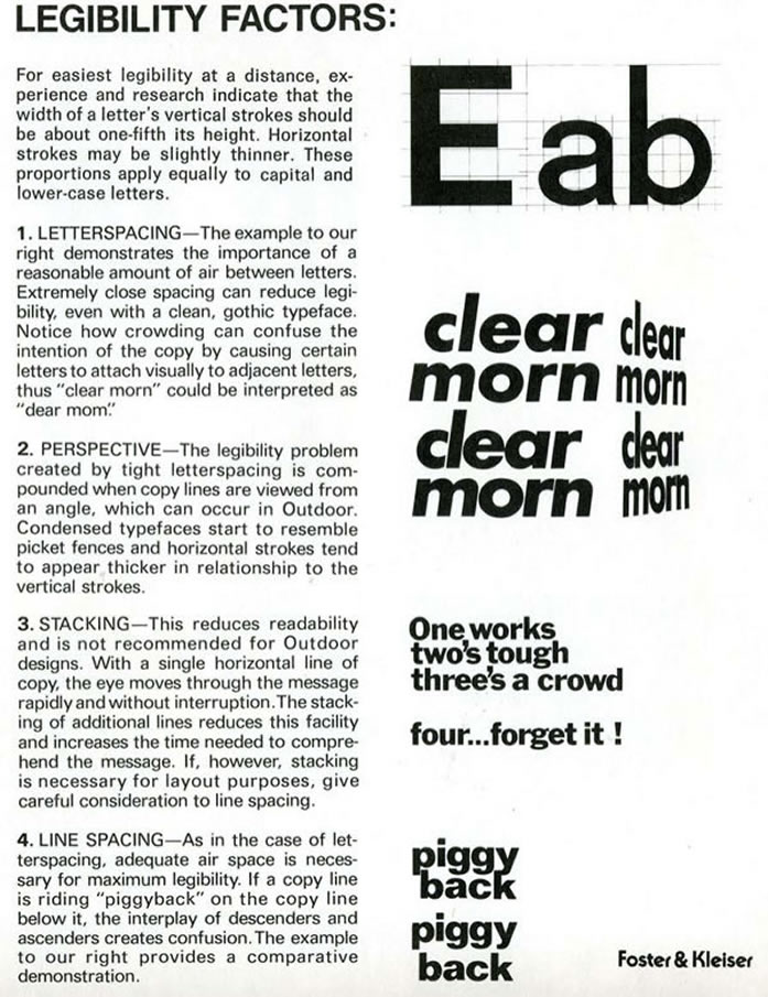
•A sign must be readable. Review the letter visibility chart below for more details.
TIPS FOR CHANGEABLE COPY SIGN
•Make sure your sign is always close to the road facing the direction of oncoming traffic. There should be no obstruction by trees, other buildings or vehicles. Remember that potential customers need about 7 seconds to read your sign message.
•Keep your message short, to the point and easy to read. Try to make every word in capital letters if possible. Avoid stating anything offensive or controversial.
•Make sure your sign is clean from dirt and debris. Illuminated signs should be fully lit at all times.
•Change your advertising message frequently. Different promotions appeal to different potential customers.
•Always, always check your spelling.
MAXIMUM DISTANCE
•Maximum Distance in color would be RED or BLACK on WHITE Background, 5,280' equals 1 mile.
LETTER
HEIGHTREADABLE DISTANCE
(For maximum Impact)MAXIMUM
READABLE DISTANCE
3" 30' 100'
4" 40' 150'
6" 60' 200'
8" 80' 350'
9" 90' 400'
10"100' 450'
12"120' 525'
15"150' 630'
18"180' 750'
24"240'1,000'
30"300'1,250'
36"360'1,500'
42"420'1,750'
48"480'2,000'
54"540'2,250'
60"600'2,500'
LETTERING TIPS
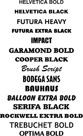
•Use simple block fonts when creating signs that need to be readable from a distance. A more stylish font may be harder to read and required to be set at a larger size. You should never set a script or cursive font in all capitals, the results will be very hard to read.
•A sign should use no more than two different fonts. There are over 3,000 fonts available, but only a handful are usually used over and over in the sign business. Use a size and boldness to create diversity and interest.
•The most popular fonts utilized for sign designs are:
A sign must be legible, well designed and easy to read.
VISIBILITY FACTORS
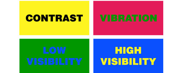
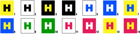
These 14 color combinations for lettering were tested using only primary and secondary colors of full hue and value. Tests for readability at a distance were conducted on different groups under the sponsorship of the OAAA.
The results averaged out in the sequence shown, with #1 the most legible moving to #14 as the least legible. It is interesting to note that negative letters (3,4,6,8,10,12 and 14) appear to have a broader stroke than their positive counterparts.
Like sound waves, light rays have varying wave lengths or frequencies. The lighted the color, the higher the frequency. These waves lengths determine perception of color. Some pigments absorb certain light frequencies and reflect others. We see the reflected frequencies as color.
Complimentary colors such as red and are not readily legible. They have similar black and white value, so their wave lengths set up a vibration. Any combination of colors of similar value, even without vibrating, will have low visibility. However, although yellow and purple are complimentary colors, they have strong contrast in value and therefore little vibration. They provide maximum visibility.
SIGNS by ART 1571 Ga. Hwy. 178 Lyons, Ga. 30436 Phone: 912-538-SIGN (7446)